Headstone Fonts and Lettering Styles: A Practical Guide
How headstone lettering actually works — sandblasted, laser-etched, V-sunk, and raised styles, plus how to choose a font that reads clearly for generations.
The main lettering methods
- Sandblasting (V-sunk lettering) — the most traditional and widely used method. A stencil is applied, then sandblasted into the stone to create a V-shaped groove. It's durable, reads clearly at a distance, and works on both flat and upright memorials.
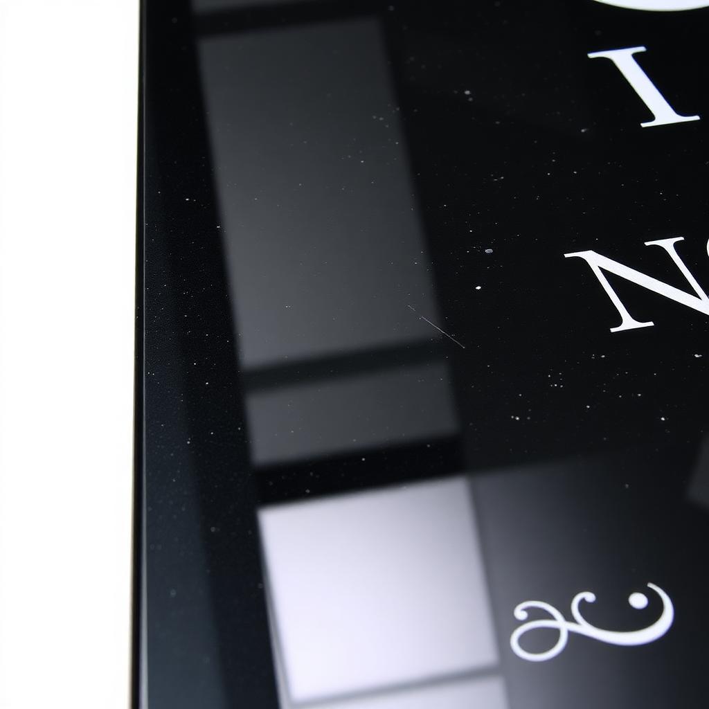
- Laser etching — a computerized laser burns the surface to create fine, detailed lettering, often light gray against the polished stone. It's the standard choice for portraits and highly detailed artwork, and works especially well on dark, polished granite where the contrast is strongest.
- Skin-traced lettering — similar in appearance to laser etching but achieved with a stencil and sandblaster rather than a laser, producing letters that are slightly deeper and brighter.
- Raised lettering — the background around each letter is sandblasted away, leaving the letters themselves polished and standing above the surface. It's a striking, higher-cost technique, generally recommended for upright monuments only, since raised letters on a flat, lawn-level marker are more vulnerable to damage from mowing equipment.
- Frosted panel lettering — sandblasts a matte panel into the polished surface first, then engraves deep letters within it. Useful on lighter granite colors where V-sunk lettering alone might not stand out as clearly.
Choosing a font
Most memorial fonts fall into a few families, and the choice affects both tone and legibility:
- Serif fonts (small decorative strokes at the end of each letter) are the most traditional and widely used style on headstones — Modified Roman in particular is close to an industry default, valued for how clearly it reads even from a distance.
- Sans-serif fonts (clean, no decorative strokes) read as more modern and are growing in popularity, especially for contemporary memorial designs.
- Script fonts offer a more personal, handwritten feel, but require careful spacing and sizing since fine details can lose legibility on stone over time, especially at smaller sizes.
What actually affects legibility over decades
- Contrast with the granite color. Dark, polished granite gives light-toned engraving (like laser etching) strong contrast; lighter granite colors generally read better with deeper sandblasted or V-sunk lettering.
- Letter depth and stroke width. Finer, more delicate fonts can lose crispness over decades of weathering, particularly on softer stones. Bolder serif or sans-serif fonts tend to hold their legibility longest.
- Finish. Polished granite creates strong contrast for fine lettering, honed and matte finishes work well with both simple and more detailed carving, and rock-faced or textured finishes generally suit bolder, less intricate lettering.
For how lettering interacts with symbols, portraits, and overall layout, see our custom engraving guide. If you're still working out the wording itself, our epitaph ideas guide is a useful starting point.
Before production: always review a proof
Regardless of lettering method or font, request a physical or digital layout proof before the stone goes into production. A proof should show the name, dates, chosen font, letter height, and any spacing or artwork — catching a crowding or spacing issue on paper is far cheaper than catching it after the granite has been engraved.
Our Design Studio lets you preview your inscription layout and font alongside the headstone shape and granite color before you request pricing, so the proof stage starts with something close to the final design rather than a blank slate.
Key Takeaways
- Lettering method (sandblasted, laser-etched, raised, and others) and font choice are separate decisions that both affect how an inscription reads and ages.
- Serif fonts like Modified Roman remain the most traditional and widely used choice for headstone lettering, valued for long-distance readability.
- Raised lettering is generally recommended for upright monuments only, since it's more vulnerable to damage on flat, lawn-level markers.
- Contrast between the lettering method and granite color has a bigger impact on legibility than font choice alone.
- Always review a physical or digital proof before production — it's far cheaper to fix a spacing issue on paper than on finished granite.
Next Step
Want to see how a font and lettering style would actually look on your design? Try the Design Studio or request a quote to talk through options with our team.
Frequently Asked Questions
What is the most common headstone font?
Modified Roman, a traditional serif font, is the most widely used choice across the memorial industry, prized for clear readability even from a distance.
What's the difference between sandblasted and laser-etched lettering?
Sandblasting creates a deeper, V-shaped groove using a stencil, while laser etching uses a computerized laser to burn fine detail into the surface — laser etching is generally preferred for portraits and intricate artwork.
Can I use a script or cursive font on a headstone?
Yes, though it requires careful attention to size and spacing, since fine, delicate strokes can lose crispness over decades of weathering compared to bolder serif or sans-serif fonts.
Does font choice affect the price of engraving?
Not usually on its own — the lettering method (sandblasted, laser-etched, raised, etc.) affects cost far more than the specific font selected within that method.
Ready to get pricing for your granite monument?
Request pricing, factory specifications, and DAP delivery timelines from our team.